
 ChatGPT
  Perplexity
  Gemini
  Claude AI
 If you’re reading this in 2026, you’ve probably seen accessibility move from a “nice-to-have” to something product teams actually need to think about.
The European Accessibility Act (EAA) came into force in June 2025, and many companies are still adapting their digital products to meet accessibility expectations. As audits, complaints, and accessibility reviews increase, teams are discovering that some core flows—banking apps, checkout processes, ticket booking systems—don’t actually work for everyone.
From Bangalore to Berlin, designers like us are turning “legal panic” into practical UX fixes.
The EAA is the law.
WCAG 2.2 is the design playbook.
This guide skips the heavy standards jargon and focuses on five accessibility patterns designers can realistically implement without blowing up the roadmap.
And yes—most of these fixes will make your UX better anyway.
What the EAA Actually Means For You
The European Accessibility Act (EAA) is an EU regulation requiring certain digital products and services to be accessible to people with disabilities.
It applies to services such as:
E-commerce platforms
Banking and financial apps
Ticketing systems
Telecom services
Streaming platforms
E-books and reading services
If your product serves users in the EU, the EAA can apply—even if your design or development team is located somewhere else, like India. What matters is where the service is offered, not where the team is based.
Think of it this way:
The EAA says “this must be accessible.” WCAG 2.2 explains how to design it that way.
Most organisations use WCAG as the practical framework to meet accessibility expectations.
WCAG 2.2, Without the Standards-Speak
WCAG 2.2 is the latest version of the Web Content Accessibility Guidelines, widely used by designers and developers around the world.
Everything in WCAG maps back to four core principles often called POUR:
Perceivable People need to be able to perceive the content.
Operable They need to be able to operate the interface (keyboard, touch, assistive technology).
Understandable The interface should behave in ways users can understand.
Robust It should work across devices, browsers, and assistive technologies.
Most products aim for WCAG Level AA, which is also the level typically expected when organisations align with accessibility regulations like the EAA.
Five WCAG 2.2 Criteria
Now let’s look at five WCAG 2.2 criteria that frequently appear in real products.
1. Don’t Hide Keyboard Focus
WCAG 2.4.11 – Focus Not Obscured (AA)
If someone is using Tab or arrow keys to move around your product, they should always be able to see where they are.
Sounds obvious—but sticky headers, cookie banners, chat widgets, and floating toolbars often end up sitting right on top of focused buttons or inputs.
From a UX perspective, this is about visibility of system status.
Mouse users get hover states and click feedback.
Keyboard users rely on focus indicators.
If focus disappears behind UI elements, users lose their sense of control.
This also connects to Fitts’s Law: when the current target is clearly visible, people act with confidence. When it’s hidden, interaction becomes uncertain.
In practice, fixing this usually means:
Tabbing through real flows and checking where focus gets hidden
Ensuring focused elements aren’t covered by sticky UI
Managing focus properly when dialogs or modals open
These are small tweaks—but they make a huge difference for keyboard users and people with low vision.
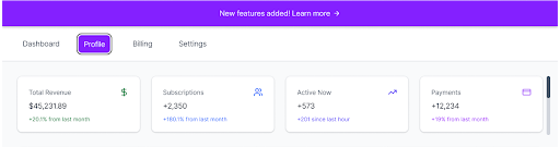
2. Make Tap Targets Large Enough
WCAG 2.5.8 – Target Size Minimum (AA)
We’ve all seen it: tiny icon buttons squeezed together in a toolbar.
They might look neat in the layout—but they’re frustrating to use, and for some users nearly impossible.
This connects directly to Fitts’s Law.
Bigger targets are easier to hit. Simple as that.
WCAG defines a minimum size of 24×24px, but in practice many designers aim closer to 40–44px, which feels much more comfortable for touch interactions.
Why this matters in real life:
Users with motor impairments struggle with precision taps
Mobile users frequently mis-tap small controls
Dense dashboards become stressful when everything is tiny
Good design here doesn’t mean “make everything huge.” It usually means:
Adding padding instead of shrinking icons
Spacing actions apart (especially destructive ones)
Making rows or cards clickable instead of relying on tiny icons
When targets are easier to hit, the entire interface feels calmer and more forgiving.
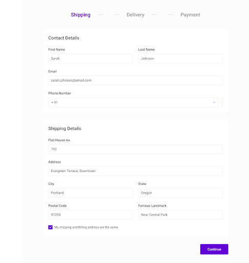
3. Don’t Make Users Type The Same Thing Twice
WCAG 3.3.7 – Redundant Entry (A)
If your product already knows something, don’t ask users to enter it again.
This aligns with the UX principle of recognition over recall. It’s always easier for people to confirm existing information than to re-read and re-type it.
You’ll see redundant entry problems in flows like:
Shipping address → billing address
Profile information → contact details
Onboarding → account setup
Good UX solutions include:
Prefilling information when possible
Offering a “same as…” option
Allowing users to review and edit the data easily
This helps users with cognitive or motor challenges—but it also helps anyone who just wants to finish the task quickly.
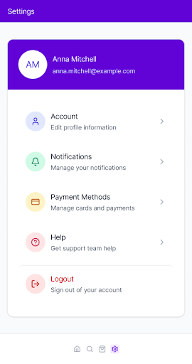
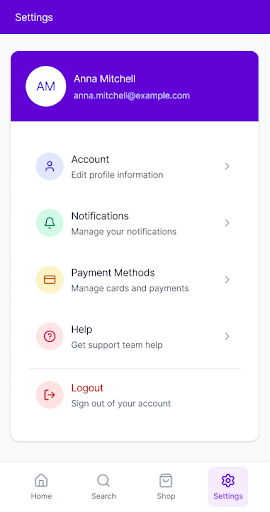
4. Keep Help in The Same Place
WCAG 3.2.6 – Consistent Help (A)
When users get stuck, they shouldn’t have to ask themselves:
“Where did the help button go on this page?”
This connects directly to Jakob’s Law. When patterns stay consistent, people don’t have to relearn your interface every time they move between screens.
If your product provides help—such as:
Chat support
Documentation links
Contact forms
keep them in the same location across related screens.
Same placement. Same icon. Same label.
This is especially important:
For new users exploring complex products
On stressful pages like billing or error states
For users who feel anxious when they can’t quickly find support
Consistency builds trust. Moving help around breaks it.
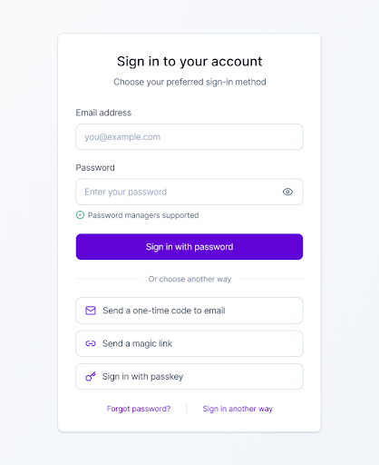
5. Make Logging In Easier to Handle
WCAG 3.3.8 – Accessible Authentication (AA)
Logging in shouldn’t feel like passing an exam.
This guideline exists because memory is limited. As Miller’s Law reminds us, people can only juggle so much information at once. Long passwords, CAPTCHAs, and complex verification flows can push many users past that limit.
WCAG doesn’t ban passwords.
It simply encourages authentication methods that don’t rely entirely on memory.
Accessible login design often includes:
Allowing password managers and copy-paste
Offering alternatives such as magic links, one-time codes, or passkeys
Making account recovery options easy to find
This helps users with cognitive disabilities—but it also helps anyone logging in while tired, distracted, or in a hurry.
Accessible authentication isn’t weaker security.
It’s security that real humans can actually use.
Wrapping Up
Accessibility can feel overwhelming when it’s framed as laws, audits, and compliance checklists.
But when you look at WCAG 2.2 through a UX lens, most improvements come down to being a little more thoughtful:
clearer focus states
larger tap targets
less repetitive form entry
predictable help placement
simpler authentication flows
You don’t need to fix everything at once.
- Start with one or two patterns.
- Test your flows with a keyboard.
- Then bake those improvements into your design system.
Small changes, shipped consistently, add up.
And that’s how accessible products actually get built.