

 ChatGPT
  Perplexity
  Gemini
  Claude AI
 We see colors everywhere and every day. They are so omnipresent that sometimes we forget they are there. Objects and people are defined by form, but color gives them character - it’s the soul behind the structure.
The Emotional Power of Color
Imagine a world without colors. Everything is greyscale. Some people perceive colors differently, such as those with color blindness. I imagine what life will be like for them. Colors are more than the spectrum of dispersed white light. They evoke emotions in us. They make us feel things. Colors can alter the way we perceive objects.
Color in Design and Branding
The impact of colors is huge in designs. In design, color isn’t just an aesthetic choice, it’s the soul of the composition. There are color theories and guidelines that designers must follow when working. Usually, color palettes include 4 colors maximum with one accent color that is bright and attention-catching, one complementary color to that accent color, and the other two neutrals, which harmonize the project.
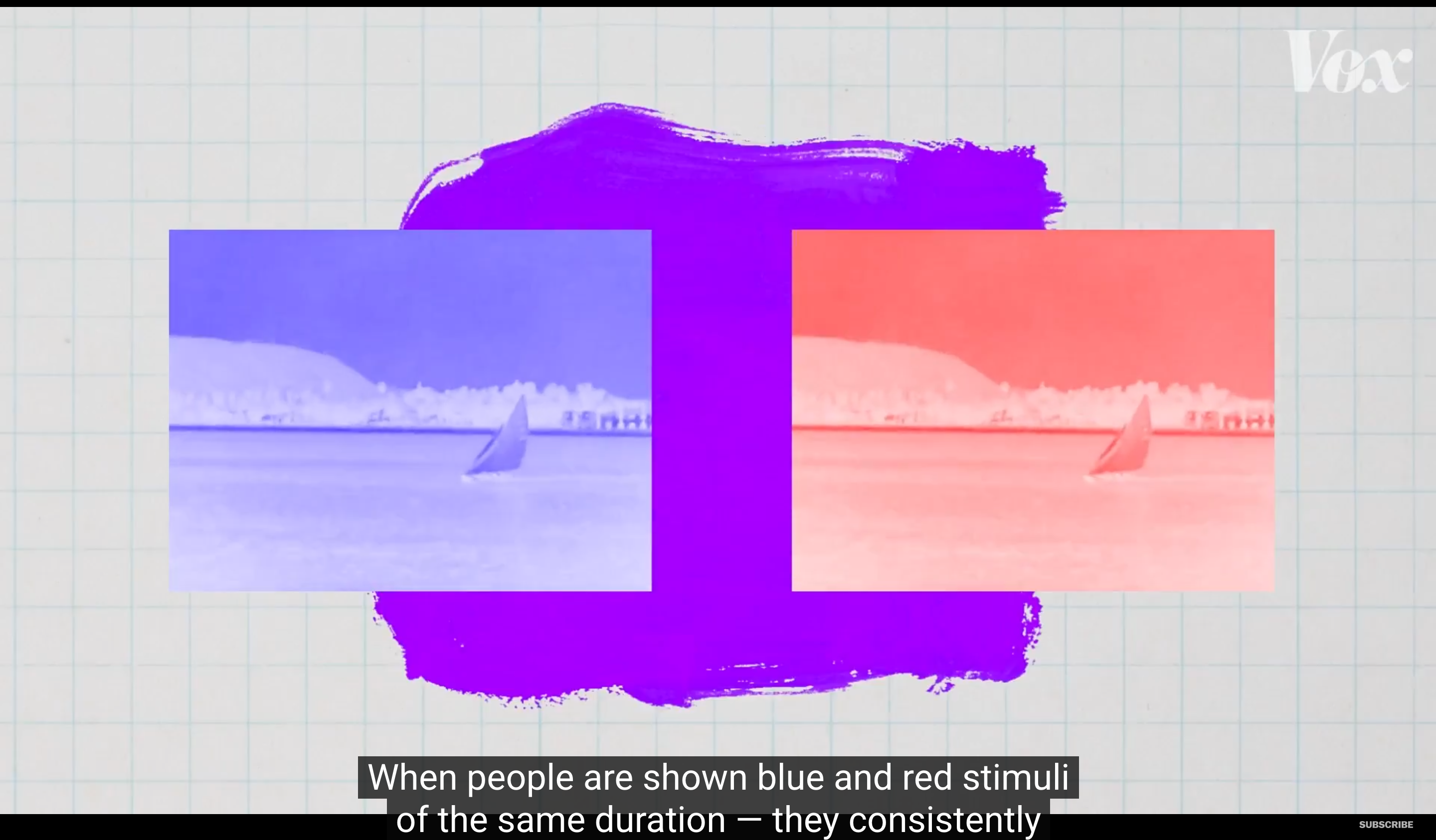
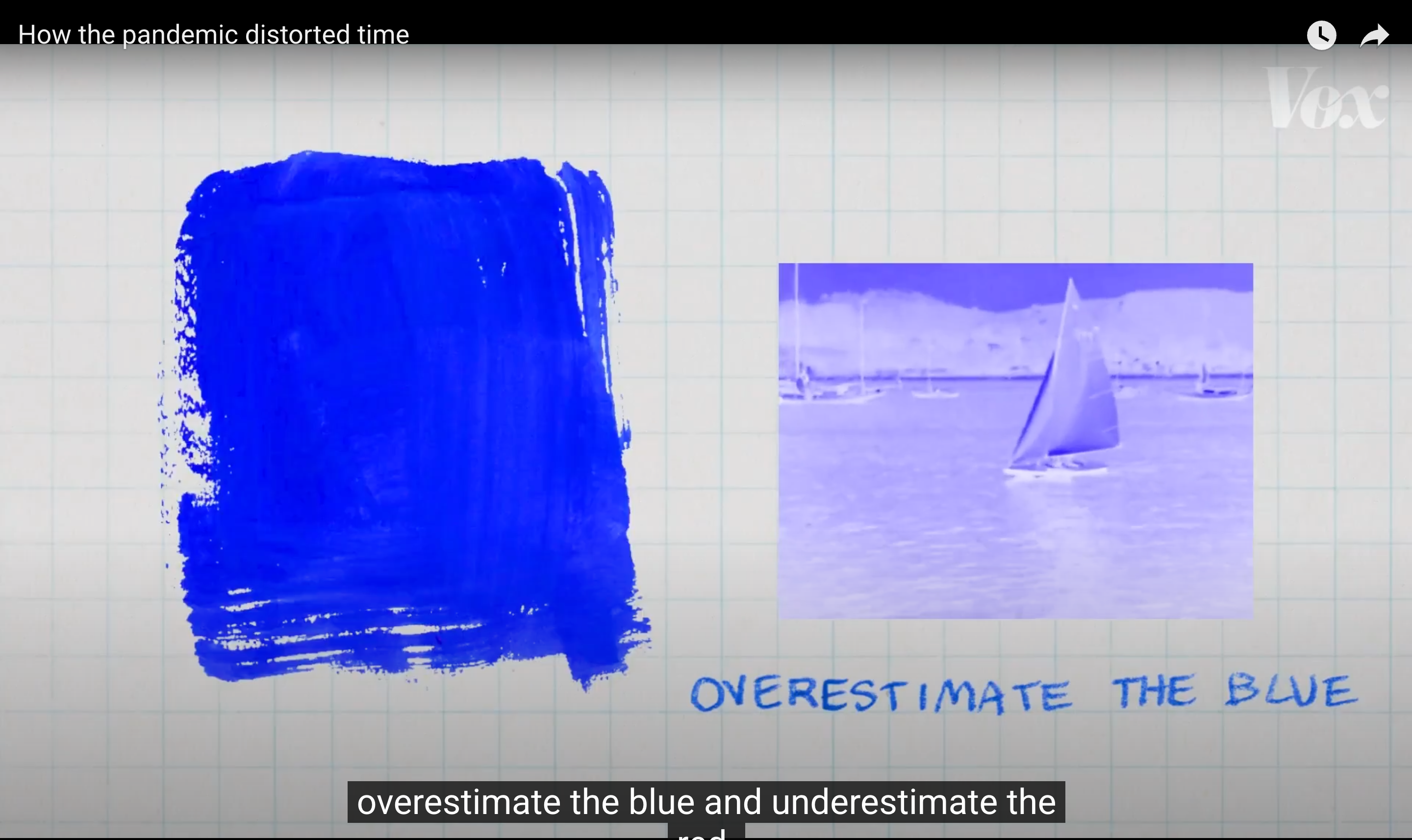
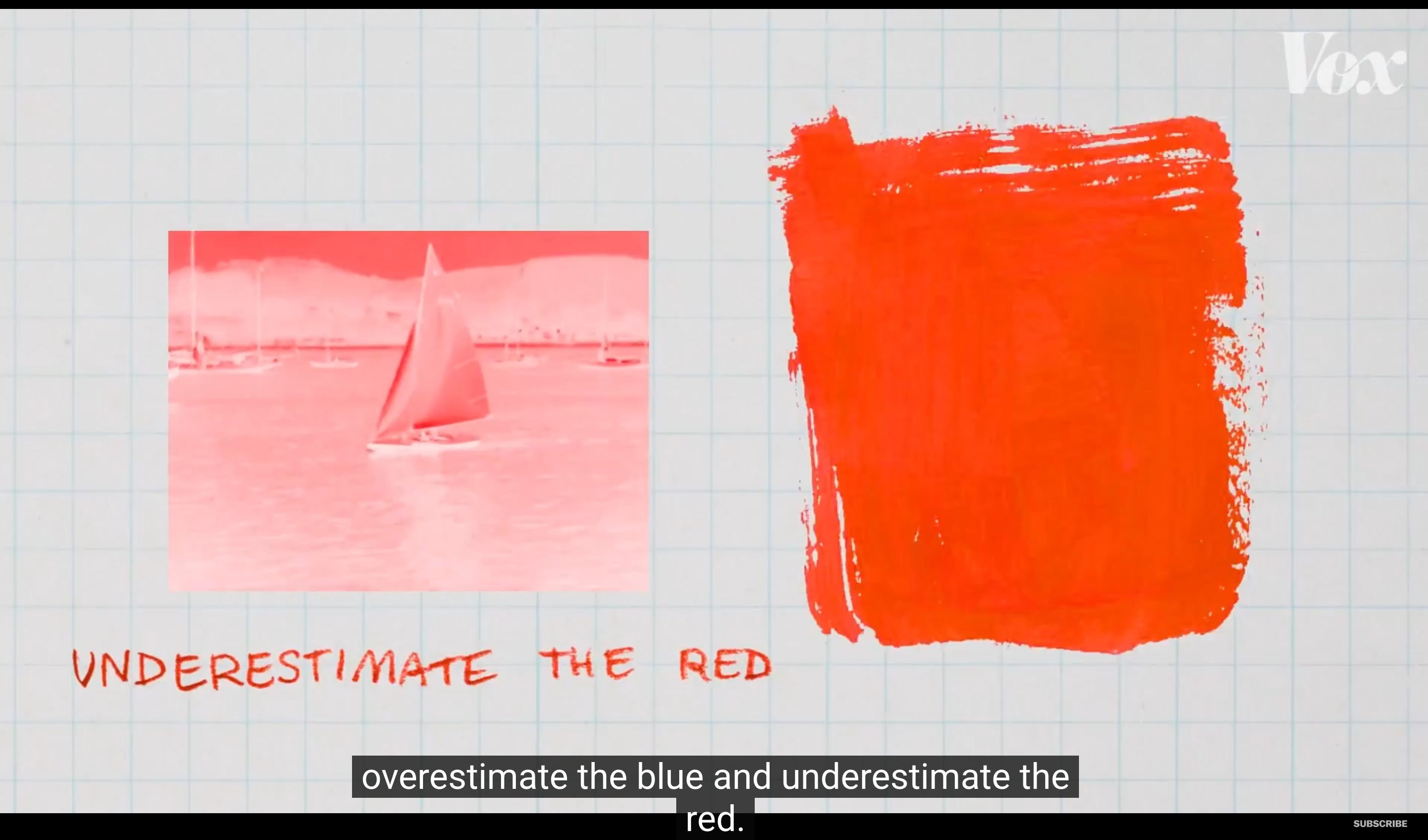
A video by Vox talks so much about color and its relationship with visuals and time. “When people are shown blue and red stimuli of the same duration, they consistently overestimate the red and underestimate the blue.”- meaning that the blue color slows time and the red color accelerates it.
The red color has this feeling of emergency and priority to it. That is why it is used in signals and signs that need to be seen.
How Industries Use Color Strategically
Different industries use color just as strategically. In healthcare, blues and greens are dominant, they convey cleanliness, calm, and trust. These colors help reduce anxiety and build a sense of safety, which is crucial in medical environments. Finance and fintech platforms often lean on deep blues, navy, and greys to communicate stability, security, and professionalism. These tones subconsciously reinforce reliability and seriousness when dealing with people’s money.
On the other hand, food and beverage brands frequently use reds, yellows, and oranges, colors known to stimulate appetite and excitement. Think of fast-food chains like McDonald's or KFC; their colors aren’t random, they're engineered to catch attention and evoke hunger. Even in luxury fashion, black, gold, and muted neutrals dominate to signify exclusivity, sophistication, and timeless elegance. Meanwhile, eco-focused brands tend to favor earthy greens, browns, and muted tones to reflect their connection to nature and sustainability.
The Role of Color in AI and Digital Interfaces
Gradient color schemes work particularly well for AI-related products and platforms because they visually reflect the complexity, adaptability, and multi-dimensional nature of artificial intelligence. Gradients - with their seamless transitions and spectrum of hues, mirror how AI systems are constantly learning, evolving, and interacting with various inputs. You’ll often find tech companies using purples, blues, and iridescent gradients to evoke a sense of futurism, intelligence, and digital depth. These color choices suggest innovation, trust, and a forward-thinking mindset.
So whether it’s the fluid, futuristic gradients of AI interfaces or the earthy greens of an eco-brand, color is never just decoration, it’s strategy. It's storytelling. It’s the unspoken first impression that shapes how we understand and trust a brand or product.
In the end, colors are not just visual details, they are experiences in themselves. They influence how we perceive, feel, and respond to the world around us. From the psychology of red and blue to the fluidity of gradient hues in AI design, color speaks a language that goes beyond words. As our visual landscape continues to evolve, especially in the digital age, understanding and using color intentionally becomes even more important. Looking at colors isn’t just about seeing; it’s about experiencing the world in its full, expressive spectrum.