
 ChatGPT
  Perplexity
  Gemini
  Claude AI
 As designers, we do more than make things look good — we shape how people interact with technology. Every button placement, scroll animation, and progress bar subtly nudges users toward a decision: to stay engaged, move forward, or drop off.
Take something as simple as two soap bars: one wrapped in plain plastic, the other in sleek, matte packaging with elegant details. The product inside might be exactly the same — but the perception of quality, trust, and desire changes instantly. The same principle applies to digital design: presentation shapes perception, and in digital products, that impact is amplified.
The way we design and present information directly affects how users perceive value, engage with content, and ultimately, whether they click, quit, or convert. In this blog, I’ll explore a few foundational UX principles rooted in psychology — and how they help us design experiences that feel intuitive, persuasive, and human.
The Four Stages of User Decision-Making
To create truly effective user experiences, we need to understand the stages users naturally go through when interacting with any digital product:
- Perception – How users filter and interpret the information we present
- Meaning – How they make sense of it within their personal context
- Action – How they respond or decide what to do next
- Memory – How they remember the interaction and how it made them feel
Let’s break down how key UX principles support this cycle.
1. Cognitive Load: How Much Is “Too Much”?
When users land on a website or app, they’re subconsciously learning how to navigate it — figuring out how to use it and complete their goals. The mental effort required to do this is called cognitive load.
And here’s the catch: our working memory — the part of our brain that holds information temporarily — is very limited. When cognitive load gets too high, users can feel overwhelmed, frustrated, or even forget what they came to do in the first place.
We can't eliminate cognitive load entirely, but good design helps reduce and manage it.
What Increases Cognitive Load?
- Too many choices at once
- Complex or multi-step tasks with poor guidance
- Lack of visual or content clarity
- Crowded or chaotic layouts

How to Reduce It
- Group related content: Break complex processes into digestible sections (think step-by-step wizards or categorized forms).
- Introduce information gradually: Use progressive disclosure to reveal details when needed — not all at once.
- Minimize distractions: Limit unnecessary visuals, bright colors, or conflicting styles that compete for attention.
- Simplify decision-making: Reduce the number of choices per screen or step to prevent decision fatigue (especially in navigation, dropdowns, and forms).
Good UX doesn’t just “look easy” — it feels effortless.
2. Social Proof: How Trust Is Designed
Social proof is the psychological tendency to follow others' actions — especially in unfamiliar situations. When we’re unsure what to choose, we look to others for cues on what’s “safe” or “correct.” This principle plays a huge role in online decision-making.
We see it everywhere — and it works because it taps into our need for validation and fear of making the wrong choice.
Where It Shows Up:
- E-commerce: We trust highly rated products over those with no reviews
- Social media: Posts with more likes and shares attract more attention
- Business tools: Companies choose what competitors and peers are using
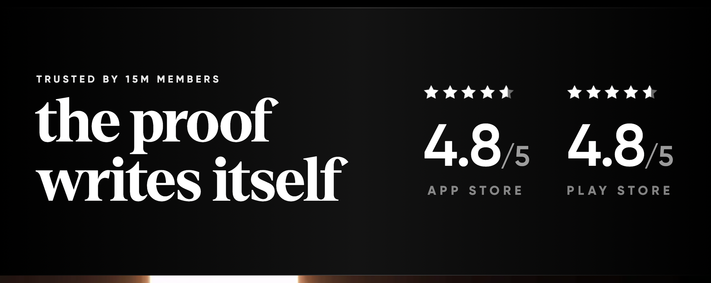
Types of Social Proof in UX
User Reviews & Ratings
- Star ratings: Quick visual judgment of quality

* __Verified buyer tags:__ Adds authenticity to reviews


- Testimonials & Case Studies
- Customer quotes: Real voices build emotional trust
* __Case studies:__ Showcase results with relevant data or metrics
- Trust Badges & Certifications
Awards, media mentions: Boosts credibility
SSL badges, compliance labels: Shows security and professionalism

- Usage Statistics
- Live counters: “5,000 people booked today” adds urgency and trust
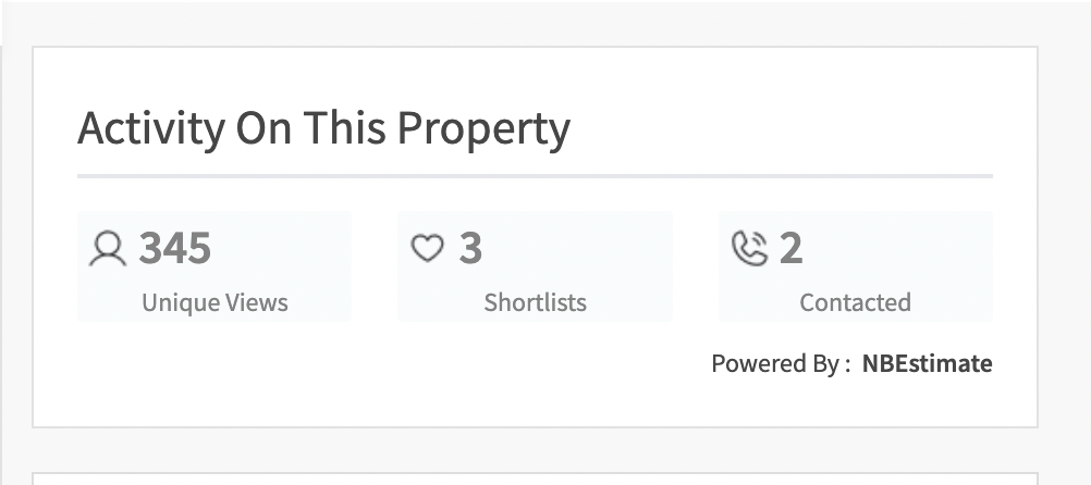
* __Milestone badges:__ “Over 1M users” signals popularity and reliability
By integrating social proof into the user journey, we can reduce hesitation and guide users to act with more confidence.
Temptation Building: The Art of Subtle Motivation
Temptation building in UX is about creating just enough intrigue, reward, or anticipation to encourage engagement. Instead of pushing users, we pull them in by making experiences feel fun, rewarding, or just too curious to ignore.
It draws from two core psychological triggers:
- Instant Gratification Bias: People prefer short-term rewards over long-term ones.
- Positive Reinforcement: When behavior leads to a reward, users repeat it.
Real-World Examples of Temptation Building
- Duolingo: Uses streaks, XP, and animations to make learning addictive — lessons feel like games.
- Medium: Displays the first few lines of an article, then fades out with a CTA — triggering curiosity.
- Skillshare: Offers previews of upcoming lessons, teasing just enough to tempt users into signing up.
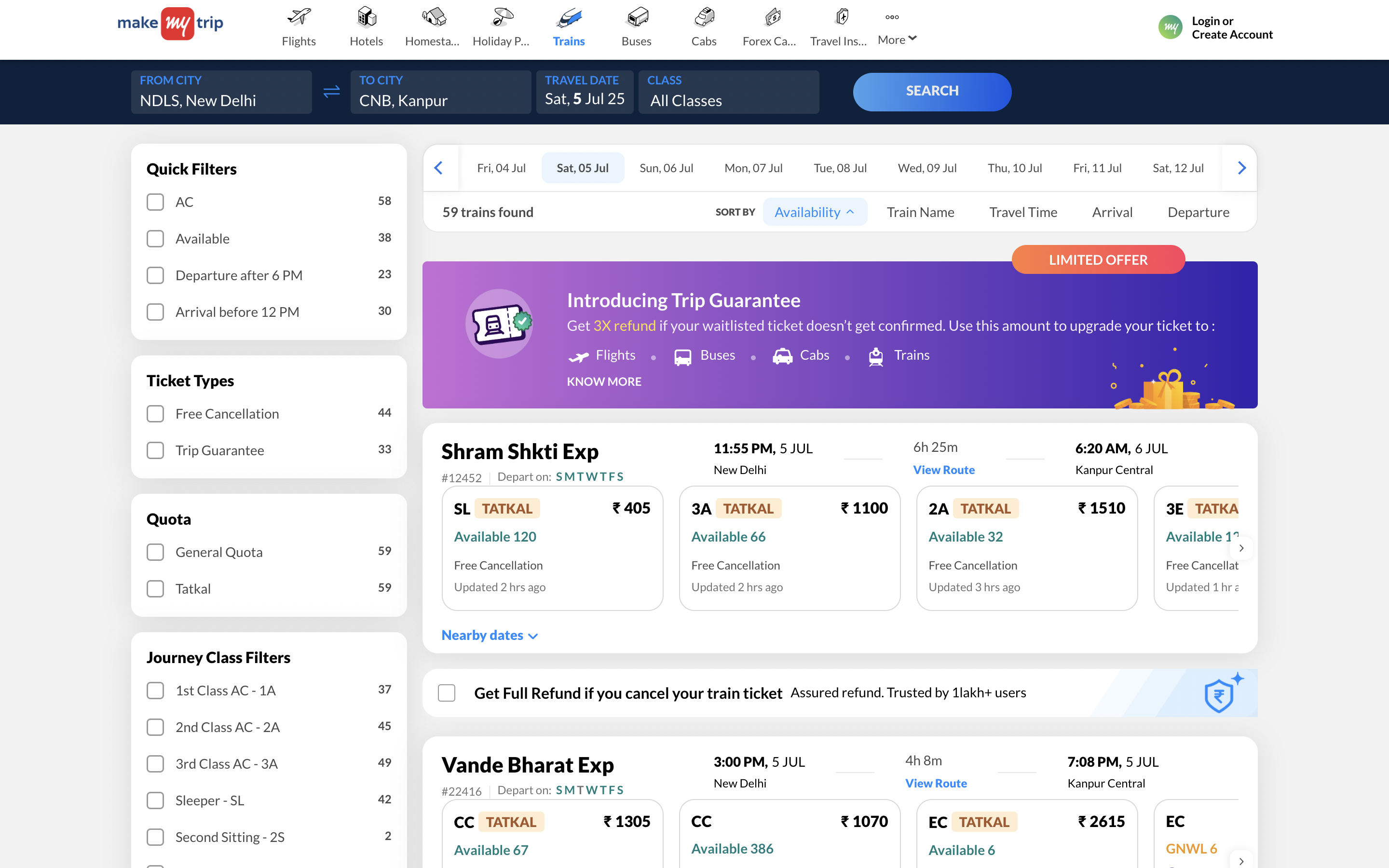
- LinkedIn: Shows “You’ve completed 60% of your profile” — a progress bar that nudges users to complete the rest (hello, Zeigarnik Effect!).
These design choices don’t demand action — they make users want to keep going.
Jakob’s Law: Why Familiarity Feels Effortless
Jakob’s Law says that users spend most of their time on other websites and apps — not yours. So when they land on your product, they bring expectations shaped by what they’re already used to.
In short: users expect your product to behave like the others they already know.
Why It Matters
Designing with familiarity in mind lowers cognitive load. It means users don’t have to learn how to use your app — they can just start doing what they came to do.
How to Apply It
- Match common patterns: Use standard iconography, navigation styles, and interaction behaviors
- Decide where to innovate: Be creative where it adds value, not just for the sake of being different
- Balance similarity & originality: Understand what your users are familiar with vs. what your competitors are doing
Real life examples
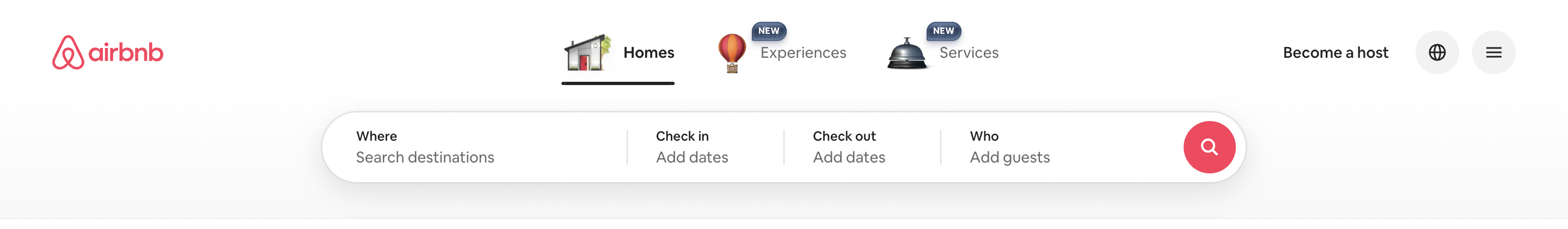
- Amazon & Airbnb : Both platforms place their search bars right at the top, front and center. Why? Because users expect to start their journey by searching — and this positioning aligns with countless other apps they've used.

- Instagram & Youtube : Whether it's “Home,” “Search,” or “Profile,” the bottom nav icons are placed in nearly the same order across mobile apps. This design taps into muscle memory, allowing users to act without overthinking.


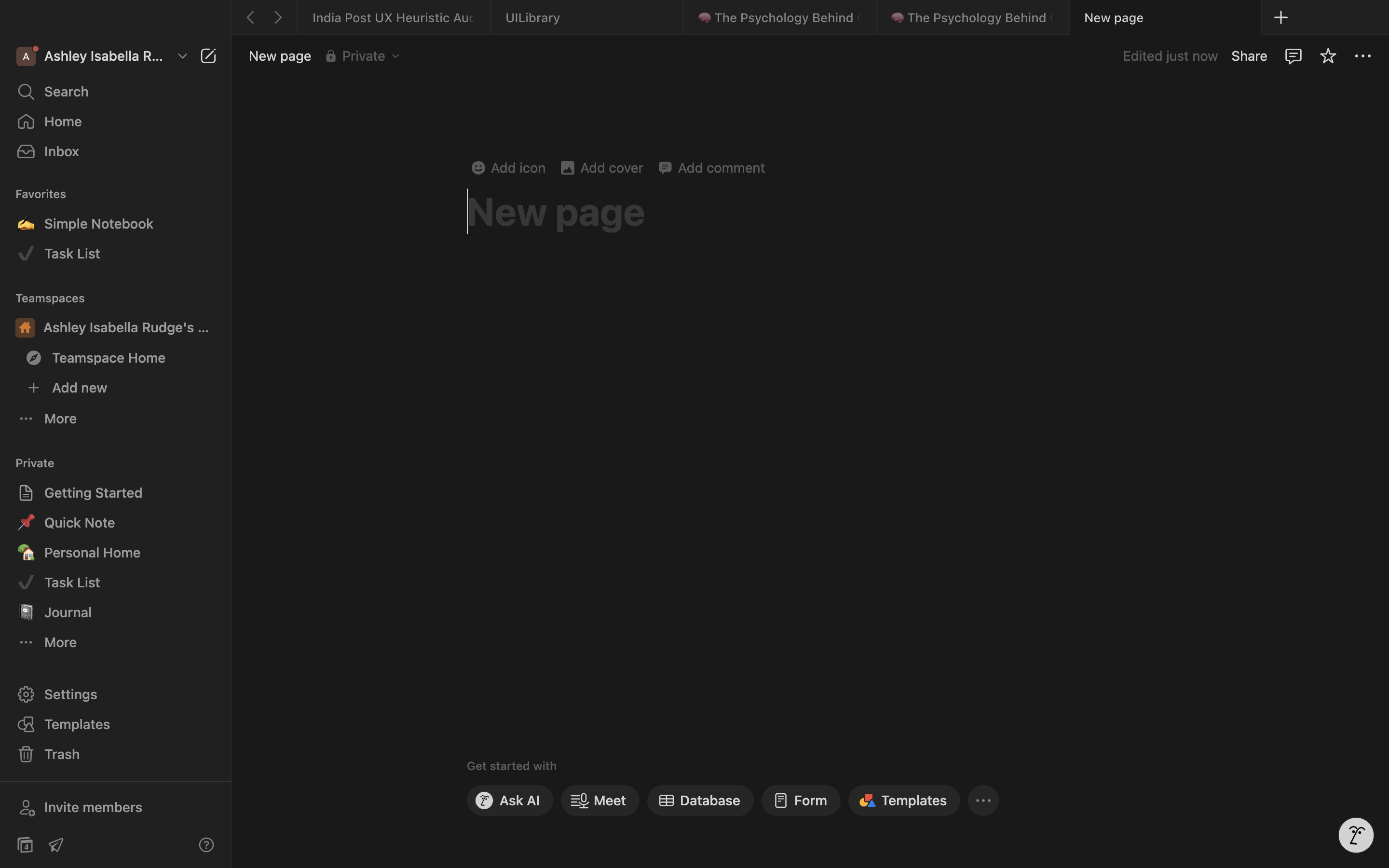
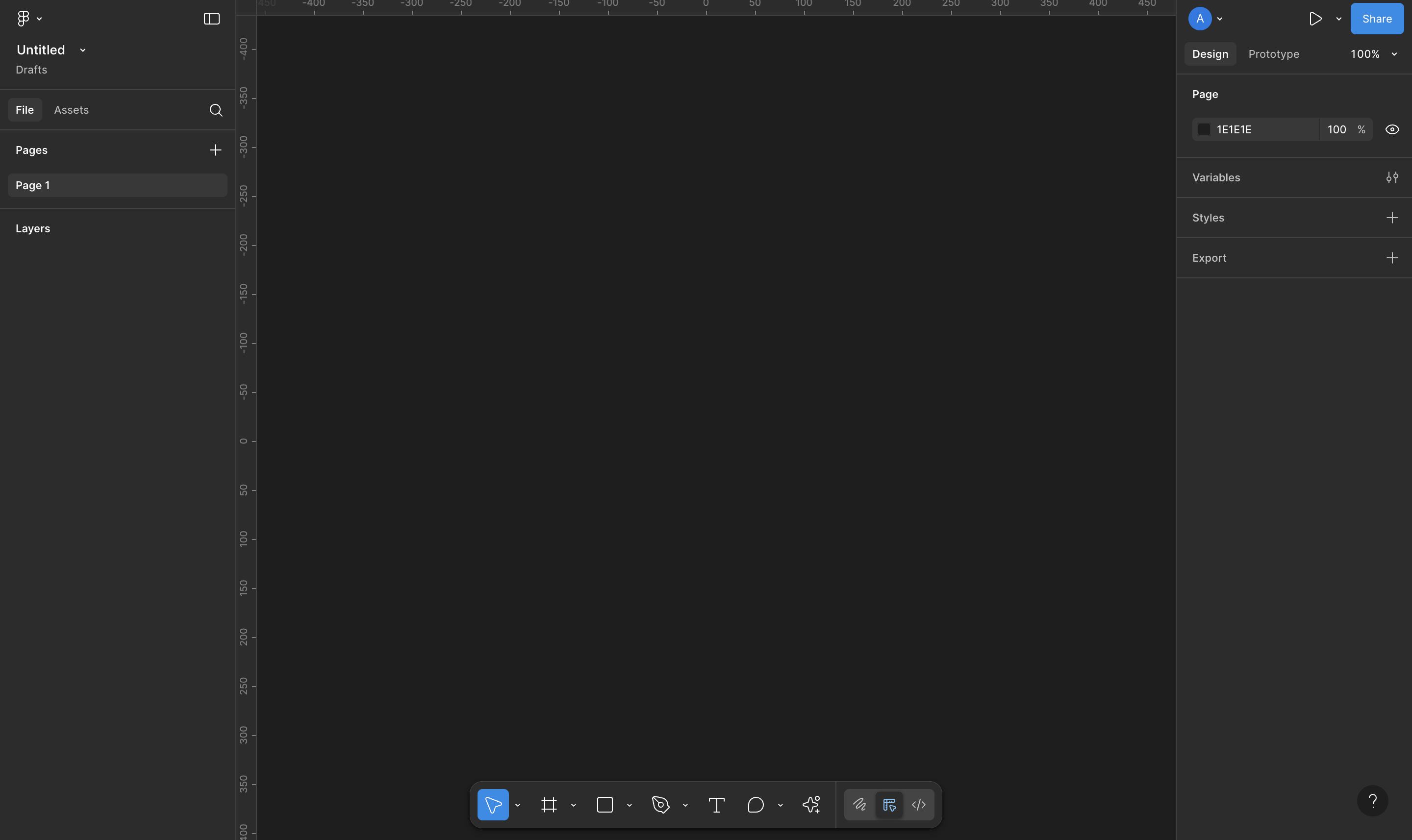
- Notion & Figma : These modern productivity tools share a left-hand workspace list, top-right action buttons, and center-focused content. Why it works: Users can focus on content creation or task tracking without having to hunt for controls.
Jakob’s Law reminds us that great design isn’t just about standing out — it’s about meeting users where they are.
Wrapping Up
Design rooted in psychology helps us create experiences that aren’t just functional — they’re intuitive, motivating, and memorable. By paying attention to how people perceive, think, and behave, we can build products that feel natural to use and easy to trust.
To recap:
- Reduce cognitive load to keep things clear and manageable
- Leverage social proof to build trust and confidence
- Use temptation building to guide users with curiosity and rewards
- Follow Jakob’s Law to stay familiar and friction-free
In the end, great UX is about designing with empathy — not just for what users want, but for how they think.