


How We Cut Astro Build Time from 30 Minutes to 5 Minutes (⚡ 83% Faster!)
Ever wondered how tools like Trello and Jira are built, where you drag and drop your to-do’s from one container to another ? This post will help you to build a similar interface using a library called react-beautiful-dnd which is open sourced by Atlassian, the parent company of JIRA and Trello.
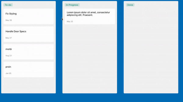
The to-do app that we are going to build will look like this:
Prerequisites
- Javascript
- React
- React Context and familiarity with the render props pattern.
Implementation
First we need to install these packages in your repository.
npm i react-beautiful-dnd @emotion/styled @emotion/react uuid
Emotion is used here for the styling but you can use anything you want for css.
Inital Data
Lets start with some data that we can use for our to-do’s. Create a file called ** KanbanData.js** in your repo and insert the following. All this is doing is mimicking an api that would give you the to-do’s.
import { v4 as uuidv4 } from "uuid"
export const data = [
  {
    id: "1",
    Task: "Create PR for the Task",
    Due_Date: "25-May-2021",
  },
  {
    id: "2",
    Task: "Fix Styling",
    Due_Date: "26-May-2021",
  },
  {
    id: "3",
    Task: "Handle Api Changes",
    Due_Date: "27-May-2021",
  },
  {
    id: "4",ƒ
    Task: "Blog on new features",
    Due_Date: "23-Aug-2021",
  },
  {
    id: "5",
    Task: "Call with Backend Team",
    Due_Date: "05-Jan-2021",
  },
]

export const columnsFromBackend = {
  [uuidv4()]: {
    title: "To-do",
    items: data,
  },
  [uuidv4()]: {
    title: "In Progress",
    items: [],
  },
  [uuidv4()]: {
    title: "Done",
    items: [],
  },
}
We are exporting an object called columnsFromBackend which contains three objects which in turn contains all our tasks.
Making a Kanban
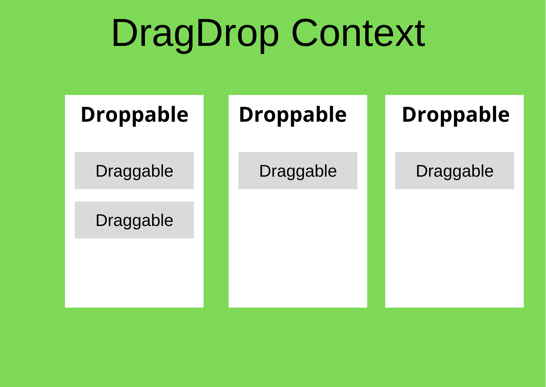
Now lets start building the Kanban where you can move your cards between containers. Create a file called Kanban.js and here we need to have three containers (For to-dos, inprogress, done) for the tasks and also a card component which contains the task details which can be dragged between these containers.
First lets import the following in our Kanban.js file.
import React, { useState } from "react"
import styled from "@emotion/styled"
import { columnsFromBackend } from "./KanbanData"
import { DragDropContext, Droppable } from "react-beautiful-dnd"
After importing lets create a Kanban Component.
const Kanban = () => {
  const [columns, setColumns] = useState(columnsFromBackend)
  return (
    <DragDropContext
      onDragEnd={result => onDragEnd(result, columns, setColumns)}
    >
      <Container>
        <TaskColumnStyles>
          {Object.entries(columns).map(([columnId, column], index) => {
            return (
              <Droppable key={columnId} droppableId={columnId}>
                {provided => (
                  <TaskList
                    ref={provided.innerRef}
                    {...provided.droppableProps}
                  >
                    <Title>{column.title}</Title>
                    {column.items.map((item, index) => (
                      <TaskCard key={item} item={item} index={index} />
                    ))}
                    {provided.placeholder}
                  </TaskList>
                )}
              </Droppable>
            )
          })}
        </TaskColumnStyles>
      </Container>
    </DragDropContext>
  )
}
export default Kanban
Now there is a lot going on here but lets take it one step at a time.
- First, we are initializing a state variable to hold all the data coming from the KanbanData.js File.
- DragDropContext basically wraps the area where you want the drag and drop to be available for.
- onDragEnd - a callback that is called when a drag ends. For example when you move a card from one position to another.
- The Container, TaskColumnStyles, TaskList and Title are the styled components where only the Title is a span and the other 3 are div’s.
- Droppable - A droppable is the place where you can actually drop things.
- The Droppable has one required prop which is the droppableId this should be a unique id so we are using the columnId as the droppableId(which is a uuid).
- The Droppable utilizes the Render Props pattern and expects its child to be a function that returns a react component.
- This function takes an argument called provided which is an object that does few important functions.
- A property called droppableProps of the provided object is designated to the component which we want to make as a Droppable.
- A function called innerRef of the provided object which is used to supply the dom node of the component to react-beautiful-dnd.
- The last property we need is the called the placeholder. A placeholder is used to increase the available space in a droppable during a drag when it’s needed. The placeholder needs to be added as a child of the Droppable Component.
- TaskCard is another component which we will be creating. This contains the details of the task and we will be dragging this component around the different Droppable’s.
Here is a picture representing the Drag and Drop Components.
Now our columns in the state is an object that contains three objects, so we use Object.entries to give us an array of the key value pair to map and create three droppable containers. In Each of the Droppable containers we map the tasks with the Task Card(Draggable) component.
Task Card Creation
Lets create the Task Card component.
Import the following in the Component.
import React from "react"
import { Draggable } from "react-beautiful-dnd"
import styled from "@emotion/styled"
In the TaskCard Functional Component
const TaskCard = ({ item, index }) => {
  return (
    <Draggable key={item.id} draggableId={item.id} index={index}>
      {provided => (
        <div
          ref={provided.innerRef}
          {...provided.draggableProps}
          {...provided.dragHandleProps}
        >
          <TaskInformation>
            <p>{item.Task}</p>
            <div className="secondary-details">
              <p>
                <span>
                  {new Date(item.Due_Date).toLocaleDateString("en-us", {
                    month: "short",
                    day: "2-digit",
                  })}
                </span>
              </p>
            </div>
          </TaskInformation>
        </div>
      )}
    </Draggable>
  )
}

export default TaskCard
Again lets take this step by step
- The Draggable component provided by react-beautiful-dnd is required to have 2 mandatory props the draggableId and the index.
- Like the Droppable, the Draggable also requires its child to be a function and again we have to take the render props pattern here.
- The first argument is again called provided and just like the Droppable we have similar properties attached here along with something called dragHandleProps.
- The dragHandleprops are needed to be applied to the part of the component that we want to use to be able to control the entire component.
- We want the entire card to be controlled so we provide these props to the parent div itself.
The final step here is complete the onDragEnd callback in the Kanban.js file
const onDragEnd = (result, columns, setColumns) => {
  if (!result.destination) return
  const { source, destination } = result
  if (source.droppableId !== destination.droppableId) {
    const sourceColumn = columns[source.droppableId]
    const destColumn = columns[destination.droppableId]
    const sourceItems = [...sourceColumn.items]
    const destItems = [...destColumn.items]
    const [removed] = sourceItems.splice(source.index, 1)
    destItems.splice(destination.index, 0, removed)
    setColumns({
      ...columns,
      [source.droppableId]: {
        ...sourceColumn,
        items: sourceItems,
      },
      [destination.droppableId]: {
        ...destColumn,
        items: destItems,
      },
    })
  } else {
    const column = columns[source.droppableId]
    const copiedItems = [...column.items]
    const [removed] = copiedItems.splice(source.index, 1)
    copiedItems.splice(destination.index, 0, removed)
    setColumns({
      ...columns,
      [source.droppableId]: {
        ...column,
        items: copiedItems,
      },
    })
  }
}
Handing drag-and-drop
The onDragEnd function is called everytime when a drag is ended, this function is required to handle the rearrangement of the task items as we move it around the dragDropContext. The result object contains the source and the destination of the moved item.
The function handles 3 cases
When we move a task and try to drop it out of the dragDropContext or not within a droppable the task needs to go back the original position.
When we move a task from one droppable container to another (for eg:- when we move a task from to-do to inprogress)
- Here all we have to do is remove the task from the SourceColumn, and add it to the destination column. (here the source can be the to-do column and destination can be the inprogress column)
When we rearrange the task within the same Droppable container.Here we need to remove the task from the original position and added it to the same array at a different index which is the destination.index.
With this we now have a Kanban where we can move our tasks accordingly.
The css for the same and the entire code can be found here.
You can checkout the live demo here in codesandbox.
References and examples


